Posts

Showing posts from January, 2024

Altered Project AECP Final
Image
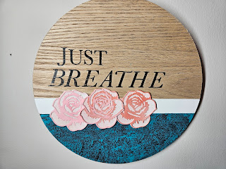
  Hello everyone! Today I'm sharing the second part of my final project for the Level 2 classes for the Aletnew Educator Certification Program. We got tasked with Altering or Upcycling an item, and I decided to alter this wall art piece I had gottern at Target a couple of years ago. I love the look of it, and how simple it is, but I also wanted to include pops of colors found around our house. We do have a coffee station in our home, and this will be the perfect accent piece for that space. I started by applying a bit of masking tape over the bottom black portion of the circle. I decided to add some color with Apple Barrel acrylic paint in the color Laguna. It is the perfect shade of teal (in my opinion). I didn't sand the piece before hand because I will be addimng texture, but you can definitely do that if you want full coverage. Using a dry paper towel, I will go over the still wet paint, leaving behind "splotches" on the surface. This is a fun and easy way to add

AECP : My Design Process for Masculine Cards

Image
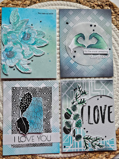
  Hello everyone! It's been 2 years since my last post and I am now finally able to share my final project for Altenew AECP. The final challenge was to create 4 masculine cards, using 3 techniques learned from the Altenew classes.  The techniques I have chosen are: Clean and Simple Boutique Cards Stencil Techniques With a Twist I also included some design features that i feel really help pull in together the collection of cards I have made. These include Watercolor techniques, Monochromatic designs, and Magical Marker. I also included elemtns often associted with masucline imagery life greenery (leaves) and abstract shapes. I was fully inspired by my upcoming Annivesary to create some fun, simple, unique cards that are easy to make and a ton of fun to gift. You can get the full tutorial for each of these cards by visiting my YouTube Channel I decided to incorporate one elem,ent from each previous card, on to the next design. For example, for this first card, I used the Clean and Si