Posts

Showing posts from 2020

Eny/AECP/Polychromatic/Altenew
Image
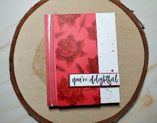
  Hello everyone, Eny here, with another fun card share, for the Altenew Academy Educators Program. For this project, I dove in to the Polychromatic class, specifically the Monochromatic lesson. I love being challenged to use just one main color or element in my designs, and this portion of the class truly inspired me. Not only with the design process, but also to get out of my comfort zone a bit.  For today’s card, I used the Altenew Bold Blossom stamp set. This set has a buildable set of images, but also a full silhouette of the rose. I used the latter, and stamped the images several times over red cardstock, with Altenew Crisp Dye Ink Ruby Red. I added shading and depth to each rose, by using alcohol markers in the same color family. I have the past year, come to love ArtnFly Sketch Markers. Absolutely affordable, and the best part , is that they are refillable. I began coloring from darkest to lightest, making sure I was blending each color along the way.  The color is rich, and vi

Eny/AECP/Beyond Basic Backgrounds/Altenew

Image
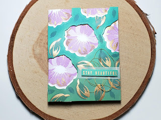
    Hello everyone! Today I am sharing with you a new project I created, for the Level 2 classes over at the Altenew Academy. I just passed my Level 1 assignment, and I am looking forward to all the classes on this second part of the journey. Today’s class was Beyond Basic Backgrounds and I will be sharing a few tips I learned. For this card, I used Altenew Build-A-Flower: Morning Glory stamp set and coordinating die. I began by trimming a Neenah Smooth White Cardstock, down to an A2 American standard card size (4.25x5.50). I will need two sheets of the same size, to create the overall design.  One of the trimmed sheets, will be run through my Sizzix Big Shot,  using the Morning Glory coordinating die. I will create “windows” , in various spots of my paper. I made sure to do it at random, but also being mindful of my placement. I wanted the flowers to be “coming down “ as if falling from the sky. On my second piece of paper, I will be adding my floral images. I used the Shades of Purpl

Eny/His and Hers Cards/Altenew AECP Level 1 Final Challenge

Image
  Hello everyone, I am on the final challenge for the Altenew Educators Certification Program Level 1 classes, and I'm so excited to share what I've learned with you. For the challenge we had to choose 3 techniques previously learned in the classes, to create one set of masculine cards and one set of feminine cards. I chose: 1- Clean and Simple Boutique Cards 2- All About Layers 1 3 - Celebration: Stencil Techniques For My cards, I took inspiration from the two most important people in my life (aside from my children), my husband and my mother. For my masculine cards I wanted to make a set of Valentines cards and for my feminine set, mothers day cards. I will say, that finding cards for a man, can be a little difficult, so being able to make something I know my husband will love, was a true treat. I wanted to create simple, clean, elegant cards, and I think I pulled it off. Creating card sets can seem daunting and exhaustive, but I have a few tips that might help in the process

Harry Potter Cards/Paper House Productions

Image
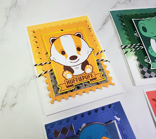
  Hello everyone! I am beyond excited to announce that I'm part of Paper House Productions Design Team for 2021! It's a journey I'm ready to embark in, and today I get to share my first project using some of their wonderful Harry Potter papers. I got four sheets of cardstock, one for each Harry Potter House, to create these fun handmade cards. I made sure to incorporate as many elements I could from each paper/pattern. These cards are A2 size (4.25x5.50) I used White cardstock to create my background. To add some coordinating colors, I used Tim Holtz Distress Oxide Inks colors: Fossilized Amber, Crackling Campfire, Chipped Sapphire and Rustic Wilderness. These sheets are double sided, on one side you have a full pattern with the particular House, and on the other you have small journal cards. I used a large postage stamp die to cut the main pattern, and then used the houses animal drawings, as my main component. I fussy cut all the images, so I could prop them with foam tap